In order to bill clients analysts had to navigate 3 legacy systems, manually checking and inputting data across all of them.
Time consuming and difficult, the billing department needed a tool that could interface between all three and empower users via automation. I gave them exactly that, and then some.

CVs Health
PROJECT NAME: Client Billing Registration (CBR)
DELIVERABLES: Solution architecture and a engineering ready Figma file of user validated designs
MY ROLE: Product designer
CHALLENGE: When clients need billing information to be updated, it follows a disjointed process across multiple teams and systems just to ensure they get billed properly. How might we understand the complex data input & interaction required between these systems and design a product that does the heavy lifting for users?
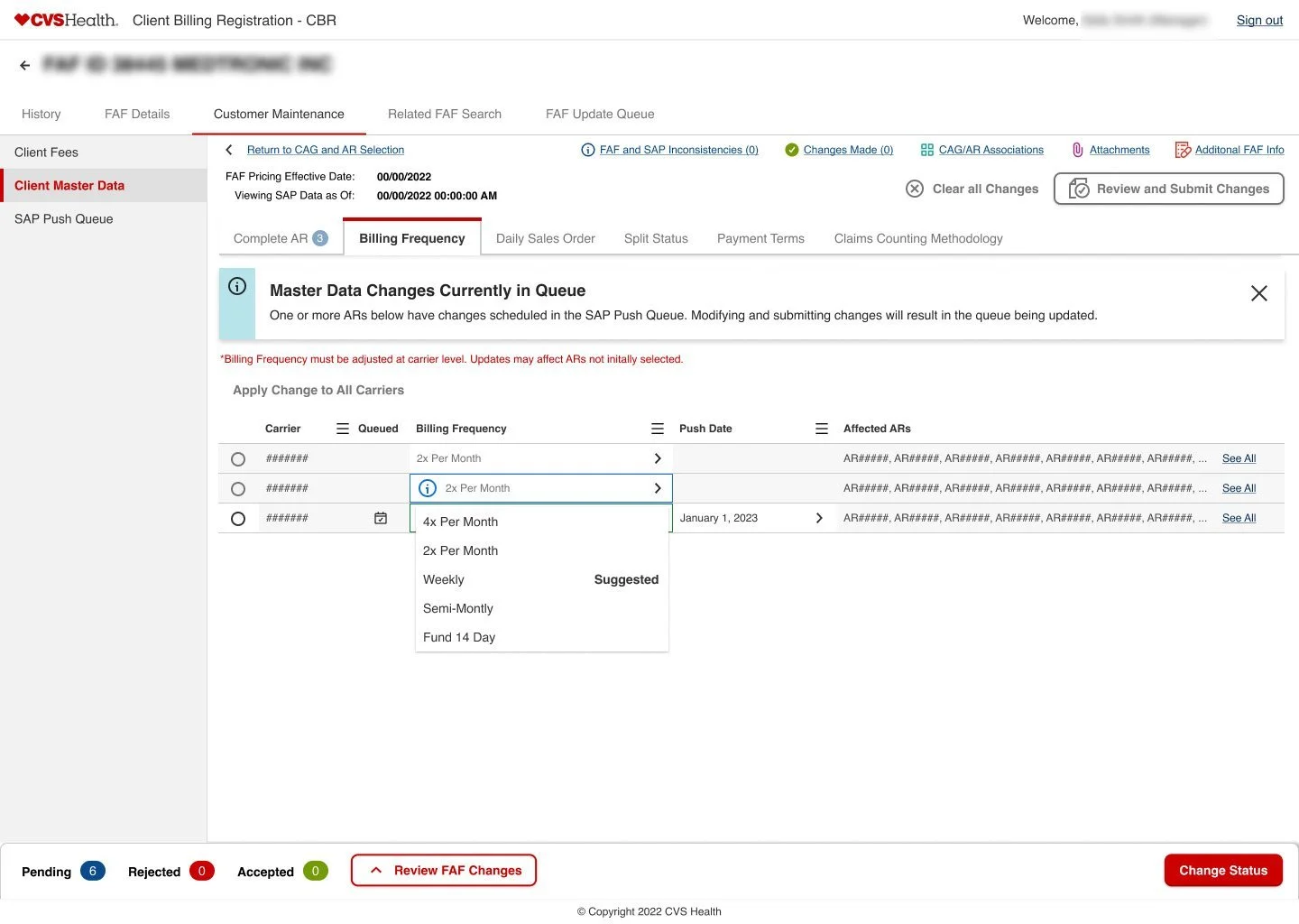
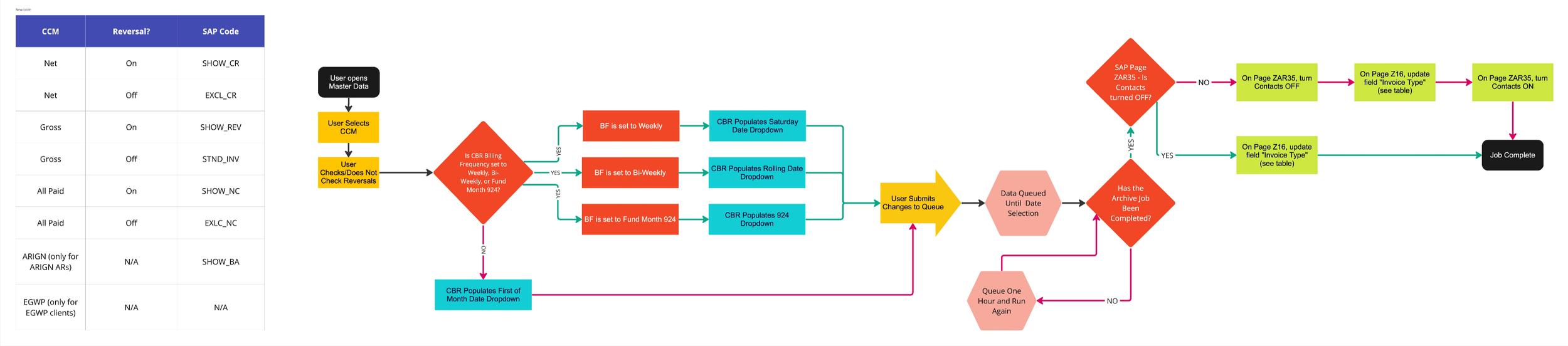
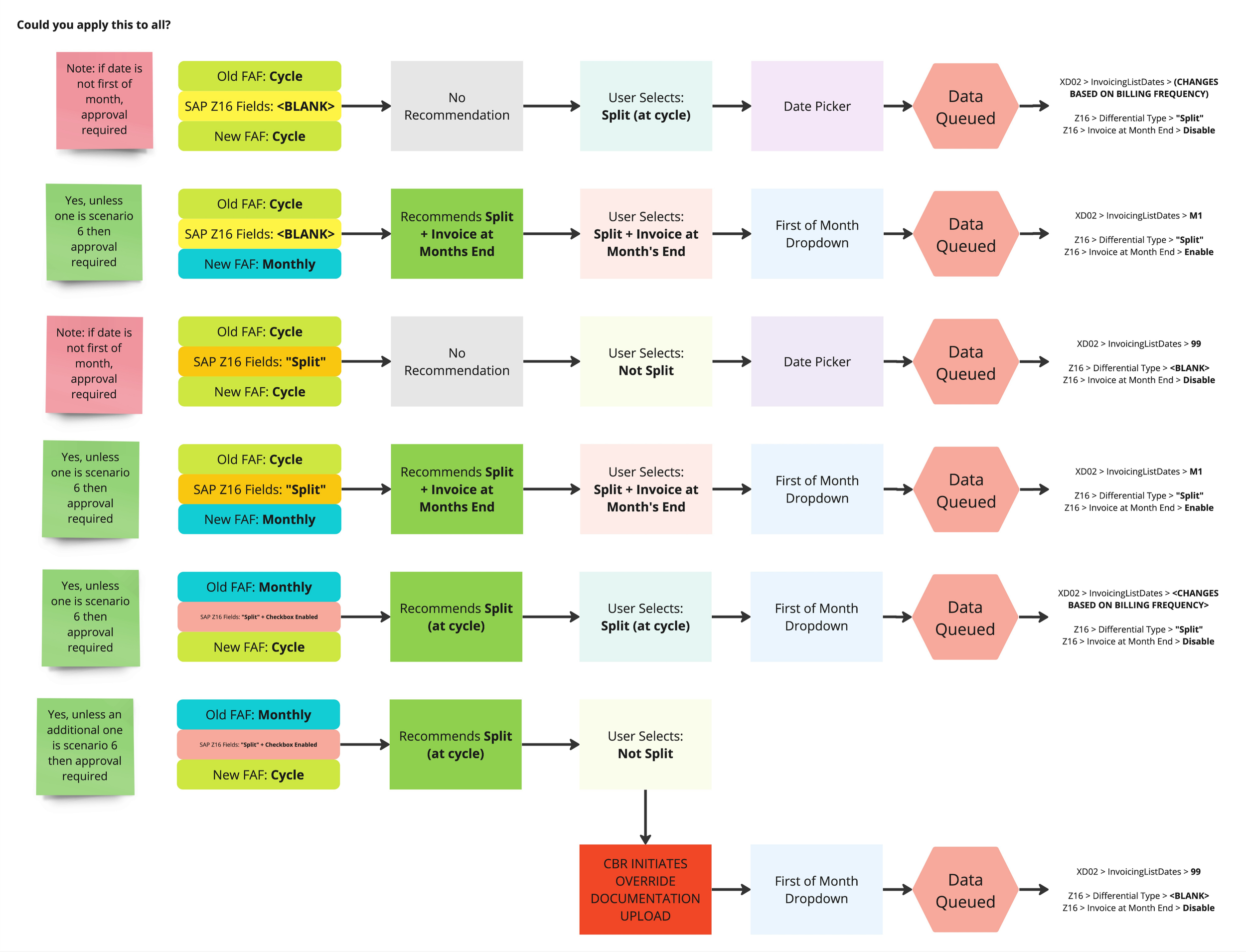
SOLUTION: The Client Billing Registration (CBR) - a single source of truth where all data can be processed and sent to all required locations.
BUSINESS VALUE: Teams of analysts are able to increase their workload. Daily takes that previously took about an hour can now be completed in 10-15 minutes.
USER VALUE: An easier means to organize and update customer billing information, in a single location.
WHAT I LEARNED: Taking the time to organize design files, stories, research and artifacts can, and often do, yield a better product for your users.
THE REsults:
-task now takes 83.3% less time to complete
-3 antiquated systems integrated into 1 seamless User Interface
The Challenge
Unlike a number of other design initiatives I’ve worked on, this was a project that I had entered after the initial discovery and framing efforts were completed. In fact, the product team had already implemented several major pushes to production. So my role as the design lead was to continue the efforts, bring new designers up to speed, and get the product team organized while keeping everything on track.
However, there was still a bit of a learning curve because the problem space was so new. I made an effort to have multiple meetings with our PMs and subject matter experts to give the existing documentation a bit of additional context (so worth it).
In a short time, I had to understand where we have been and where we have to go. I learned all about the efforts created before me to help bring a new client into our system, but where we’ve left off is how to make sure that the client is maintained overtime. Once I had that starting point, I jumped right in to meet with users to better understand their processes.
The Discovery
I started by using one of our most reliable means of information gathering tools we have at our disposal - the user interview!
The main focus was understanding the processes involved in maintaining existing clients' billing. What became evident was the high frequency of changes over time, ranging from new requests to contract alterations and specific rule requirements. This variety of requests highlighted the array of potential updates.
In total, we held over 10 interviews with our users while employing a comprehensive approach involving questioning, follow-ups, and capturing screenshots (with their consent) for annotation. After each interview, we reconvened on our Miro board for further data processing and sense-making.
We began noticing the recurring pain points that show up in the user’s day-to-day. After each step of this discovery process we were had the opportunity to validate the previous user findings and take notes of how they might affect our next iterations.
the Key Takeaways
Our interviews revealed two major challenges: Poor system communication and time-consuming onboarding.
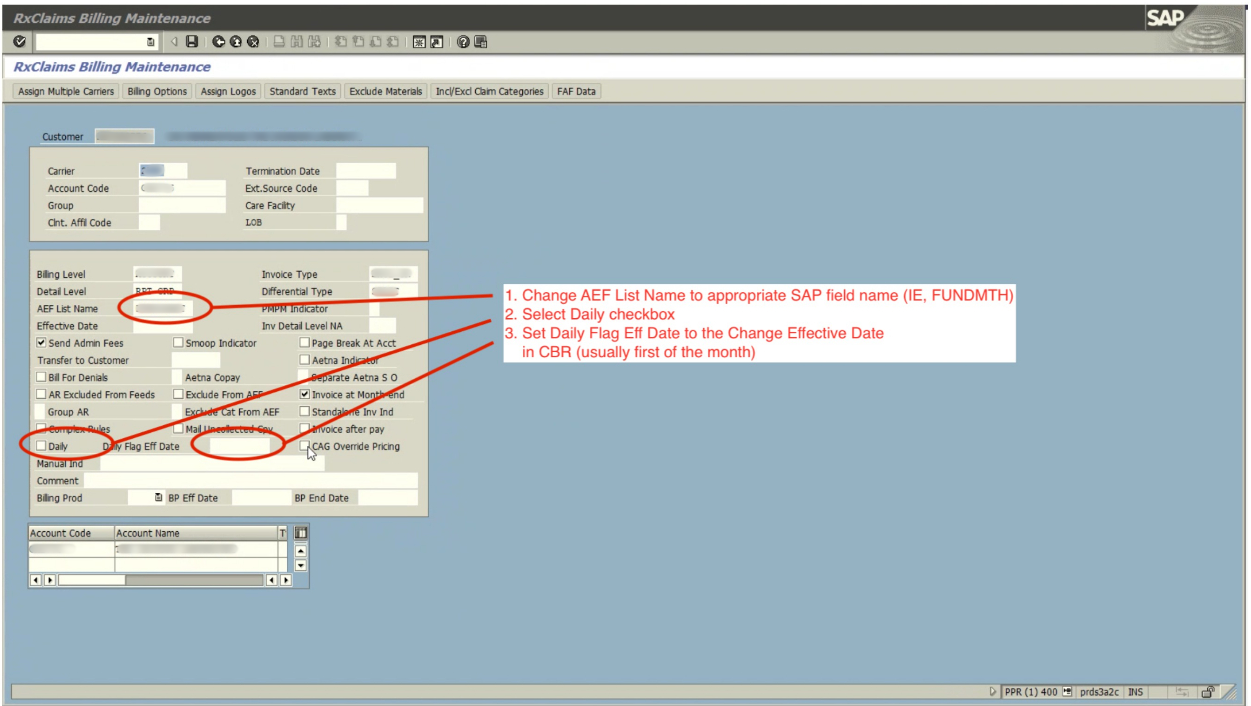
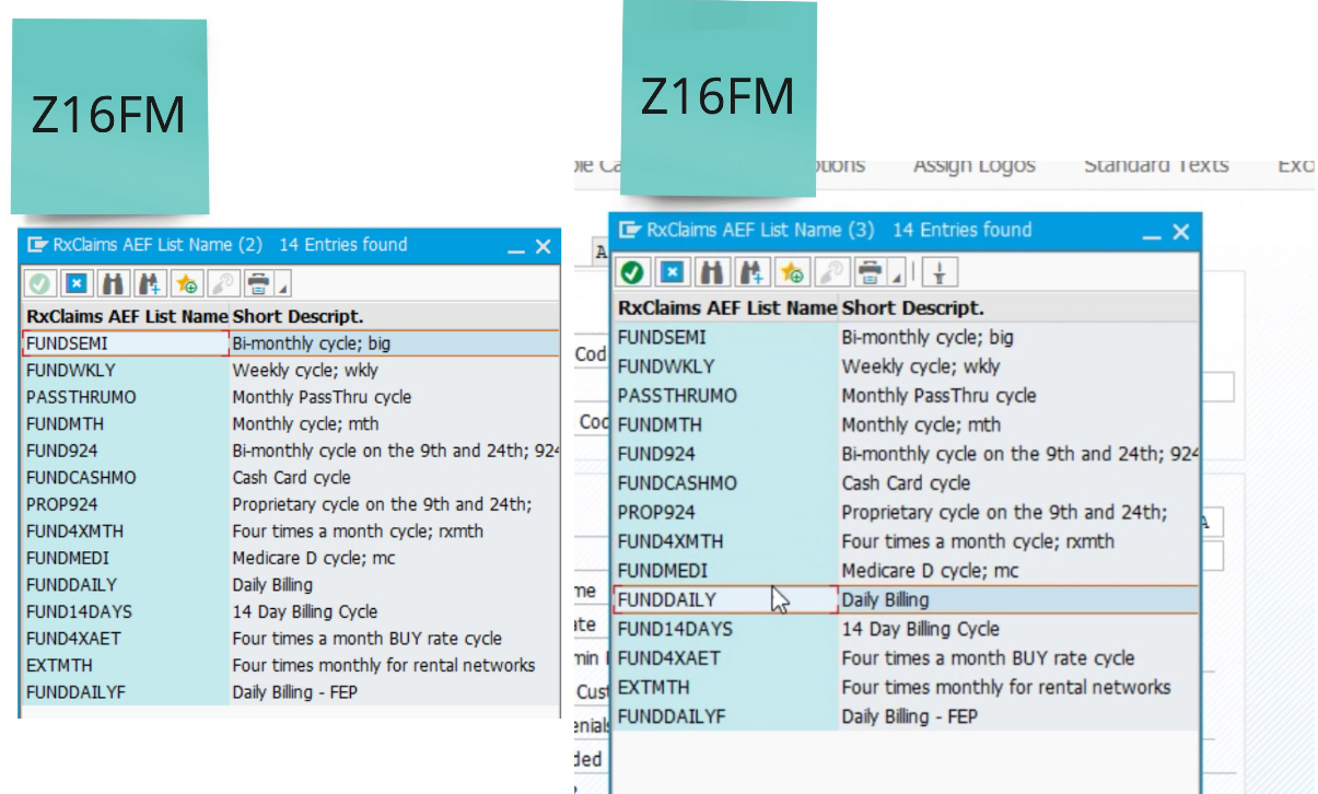
Critical tools like Salesforce, RxClaim, SAP, and Excel weren’t integrated—forcing users to manually transfer data and rely on personal knowledge of the complex billing codes that are unique to each system.
As a result, the team depended heavily on institutional knowledge, with each analyst creating their own documentation to get by.
The billing supervisor noted that it took up to 18 months for new analysts to become confident in their roles—a direct outcome of the fragmented systems and processes.
The DAta
Our main technical challenge was working within the constraints of the existing legacy systems, which were integral to processing billions of dollars in transactions. We needed our solution to serve as a bridge, automating complex tasks and instilling confidence in users regarding the accuracy of client billing updates. Not only that, we wanted to make sure that any and all solutions our team felt needed to be tested, were feasible to begin with.
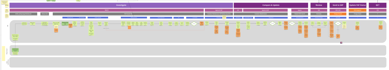
Leveraging insights from user interviews, we embarked on a thorough mapping of their current processes for updating client billing information. We paid meticulous attention to various edge cases, validated them with users, and refined our data maps until both users and stakeholders were assured of their effectiveness in implementing the necessary changes within each legacy system. These refined maps were then handed off to our engineers for story-writing as they tackled the back-end implementation.
The process of untangling all the different types of requests and what our users are expected to do with them was a complicated effort to say the least but the benefits were undeniable. We would use these findings to push through UI solutions that could not only look great, but offer more automation to make their process as smooth as possible.
The Organization and Ideation
As I’ve mentioned earlier, this project was unique because of timing. I had to ramp up quickly while inheriting a team in flux. With engineers and designers shifting roles, important artifacts and stories were scattered across different places. Before diving into ideation, I sat down with our product team of engineers and PMs to reset expectations, clarify the designer’s role, and re-organize outstanding stories in our tracking software. Cleaning up the backlog gave everyone better visibility into progress and alignment between design and engineering.
With that foundation in place, we could finally move into ideation. Previous design attempts had stalled because they failed user validation, so we stared from scratch. In collaborative sessions, we reviewed what had gone wrong and discovered a core issue: the information architecture was creating confusion and limiting flexibility.
From there, we restructured how data was displayed and how users interacted with it. This shift not only untangled the earlier design but also opened up more space and flexibility for the team. The result was a cleaner, more adaptable workflow that addressed user needs and gave the team a stronger platform to build on.

The designs
Like most of my work you’ll see, we started with sketches and lo fi concepts. It meant we could work more quickly, and stay lean without wasting too much time on something that wouldn’t present any real value to the user.
But what’s really great about this project was that the time to move from lo-fi to high-fi was very short since it meant utilization of our asset library. Having a good understanding of what we have with regards to approved patterns that are both in brand and accessible, means that we can very quickly get higher fidelity mock ups generated. So going from low to high was a pretty fast process.
Now that our screens are looking uniform and our pixels are all in a row, it was time to discuss our plans for validating with the users. Now because of the large design changes made from the first iteration, we felt it necessary to take the time and organize a formal usability test.
We outlined all the aspects we wanted to test, from that made it into a script to keep our team on task, and created an interactive prototype for the users using Figma.
Since we’re all remote these days, we setup meetings and moderated the user tests all via Microsoft Teams - and with great results might I add!